True North Cannabis Co.
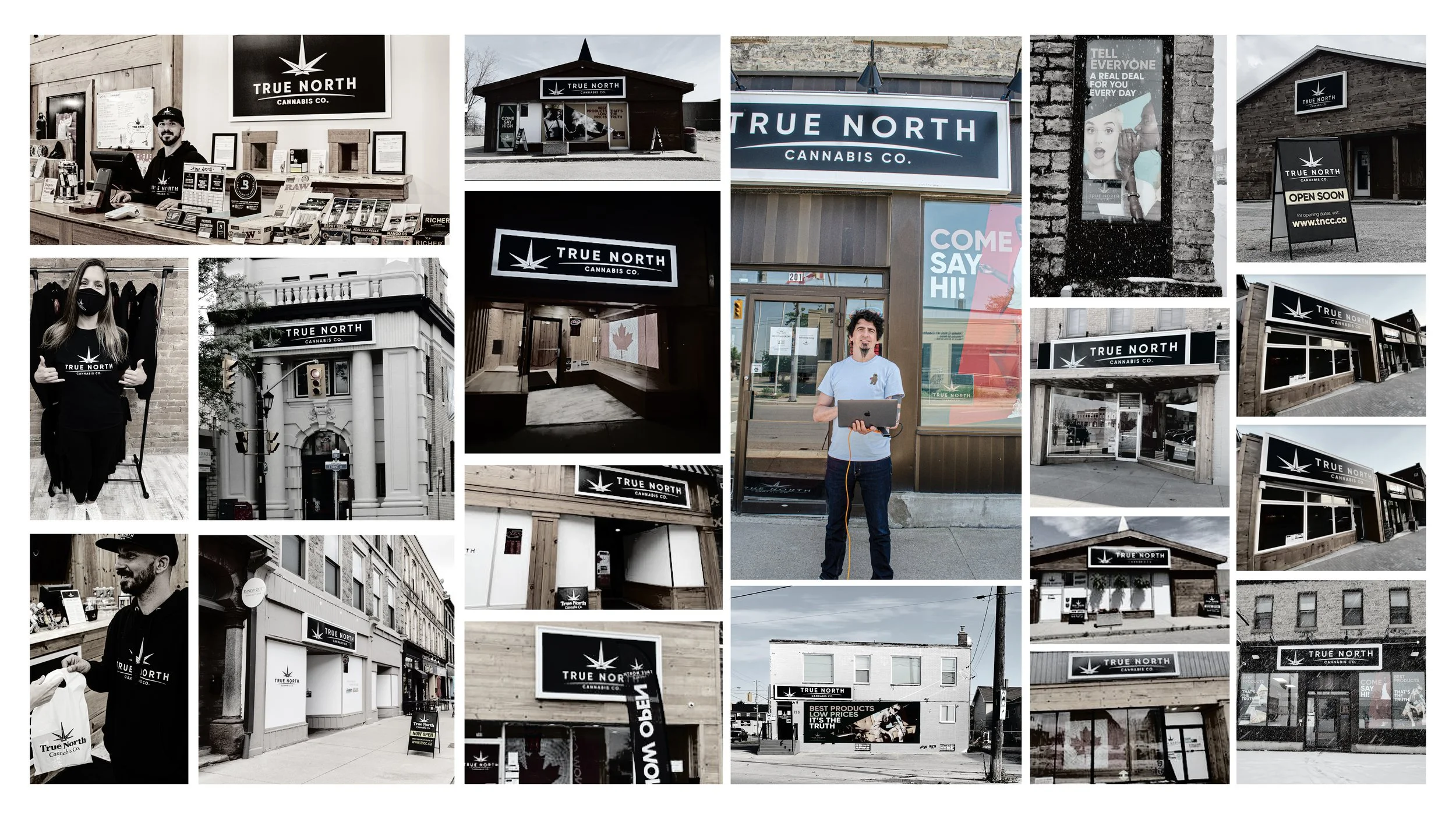
Tncc is the fastest growing cannabis retail store in Canada. And I am really proud to be part of its development.
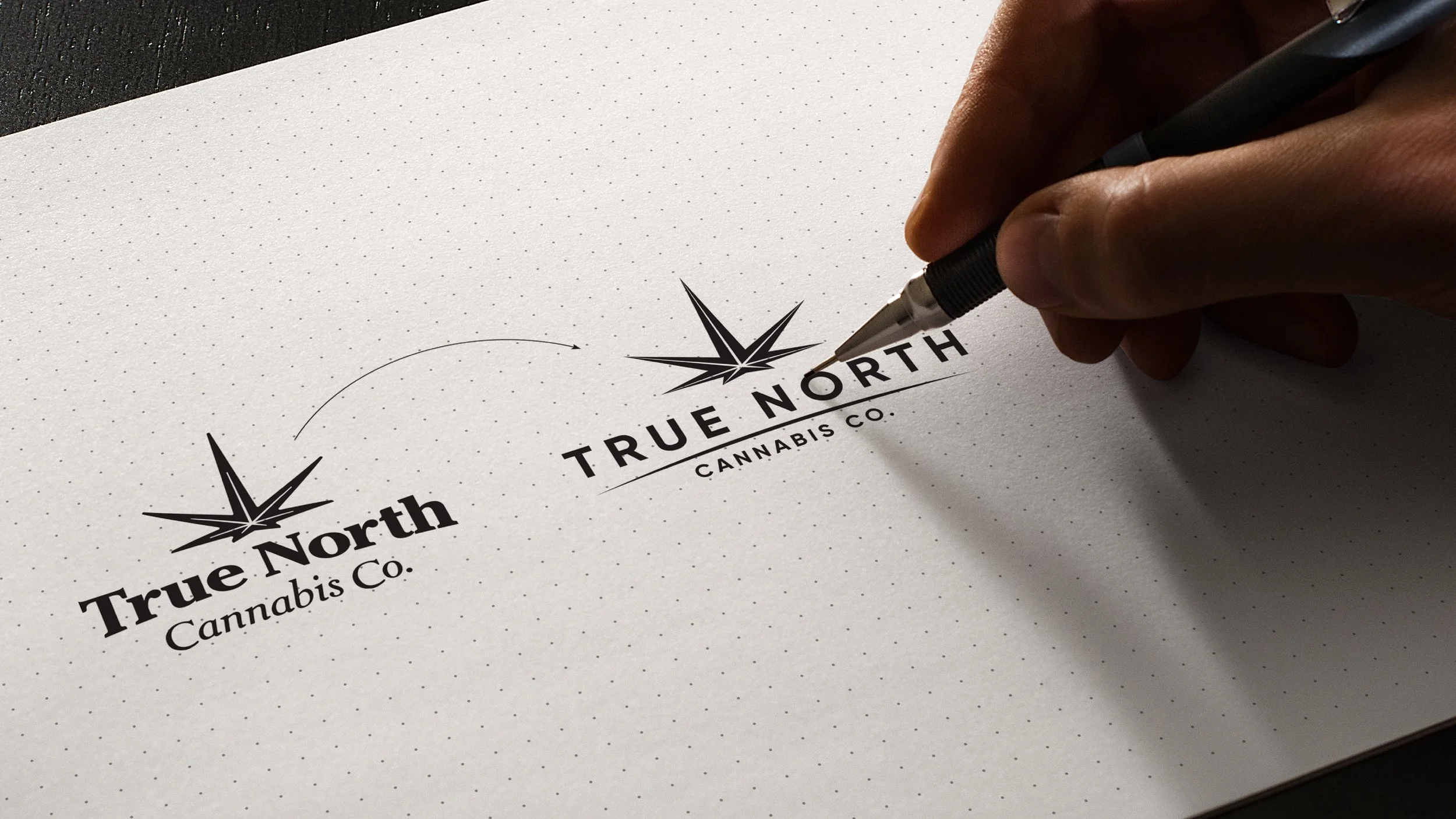
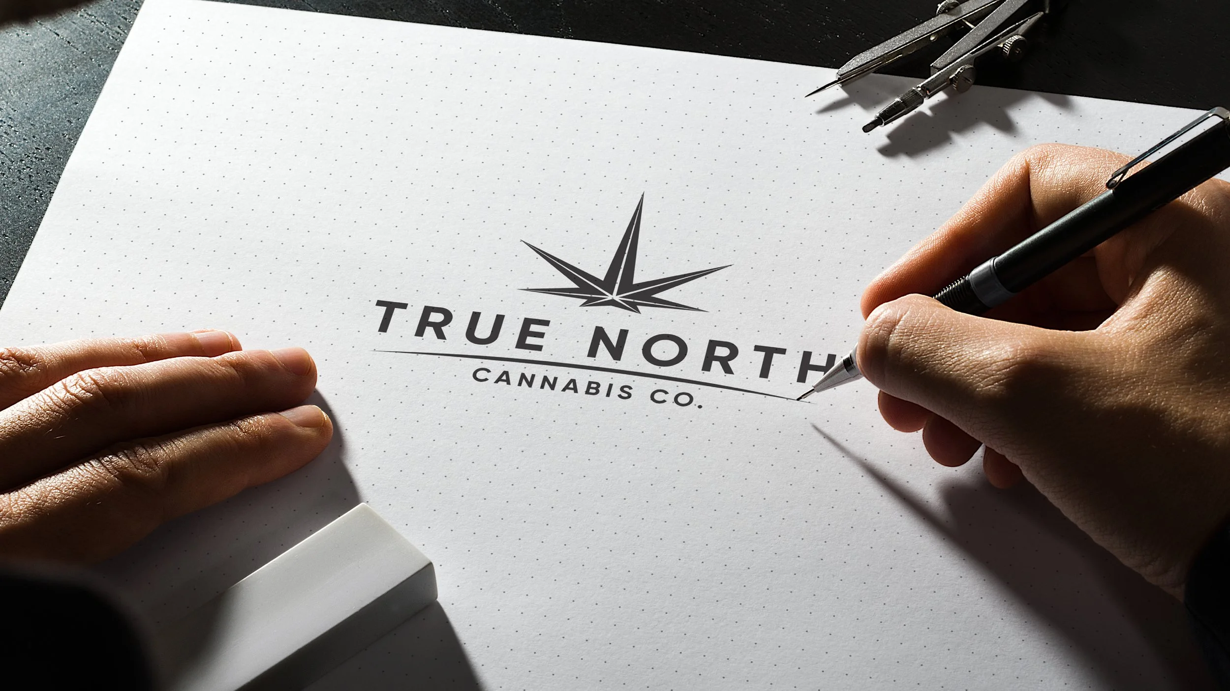
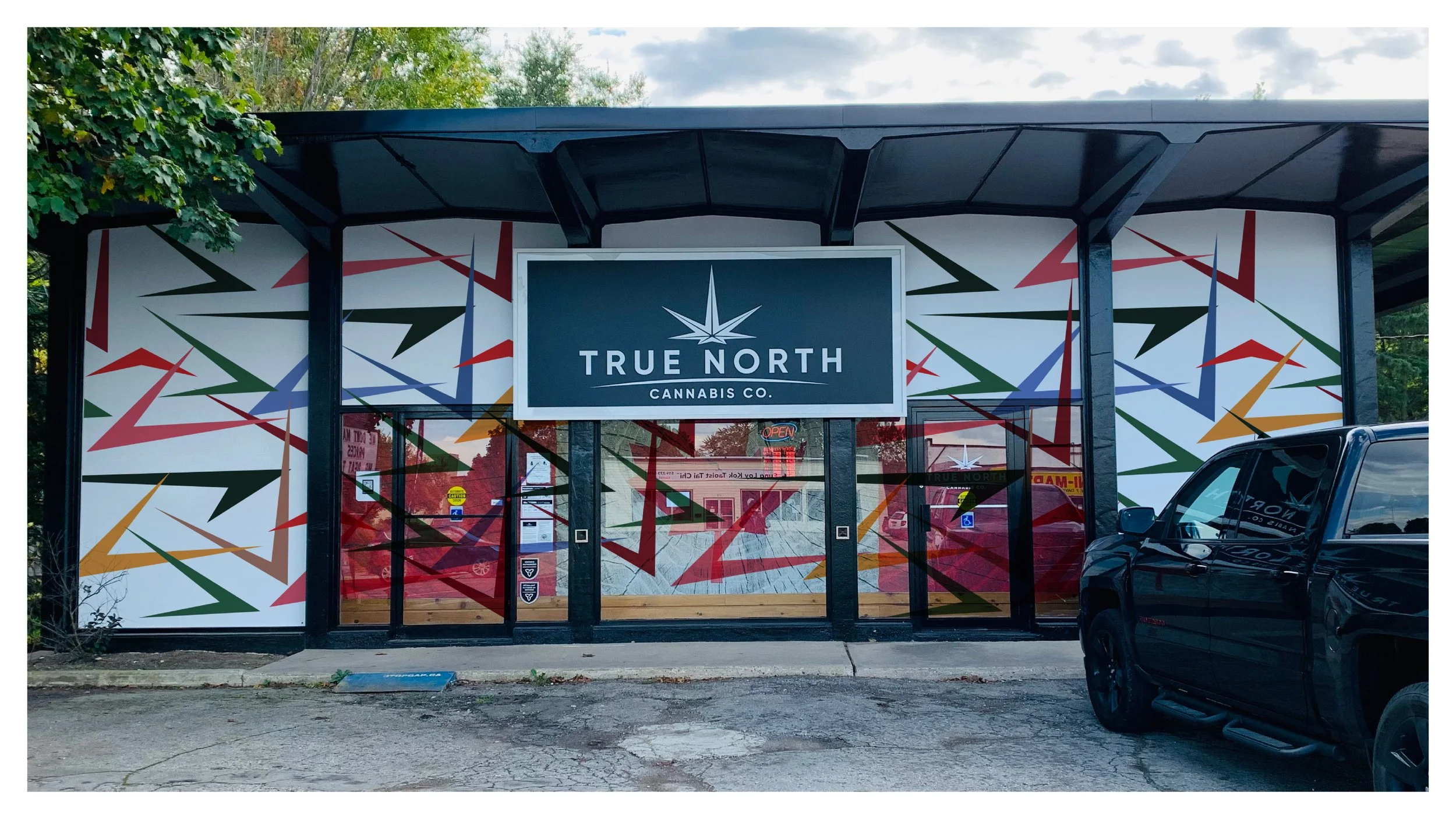
To keep up with its development, the brand needed to be redesigned.
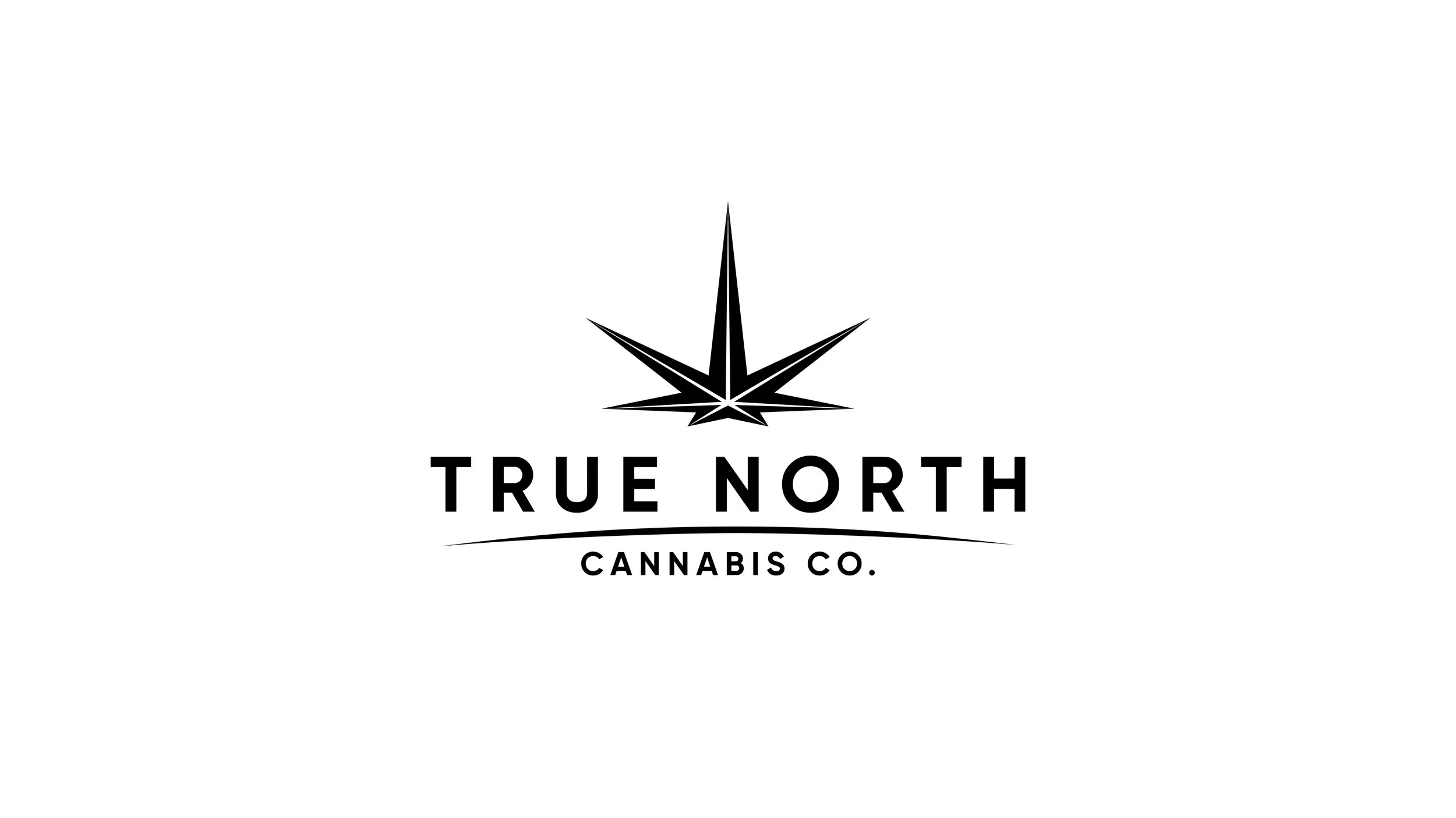
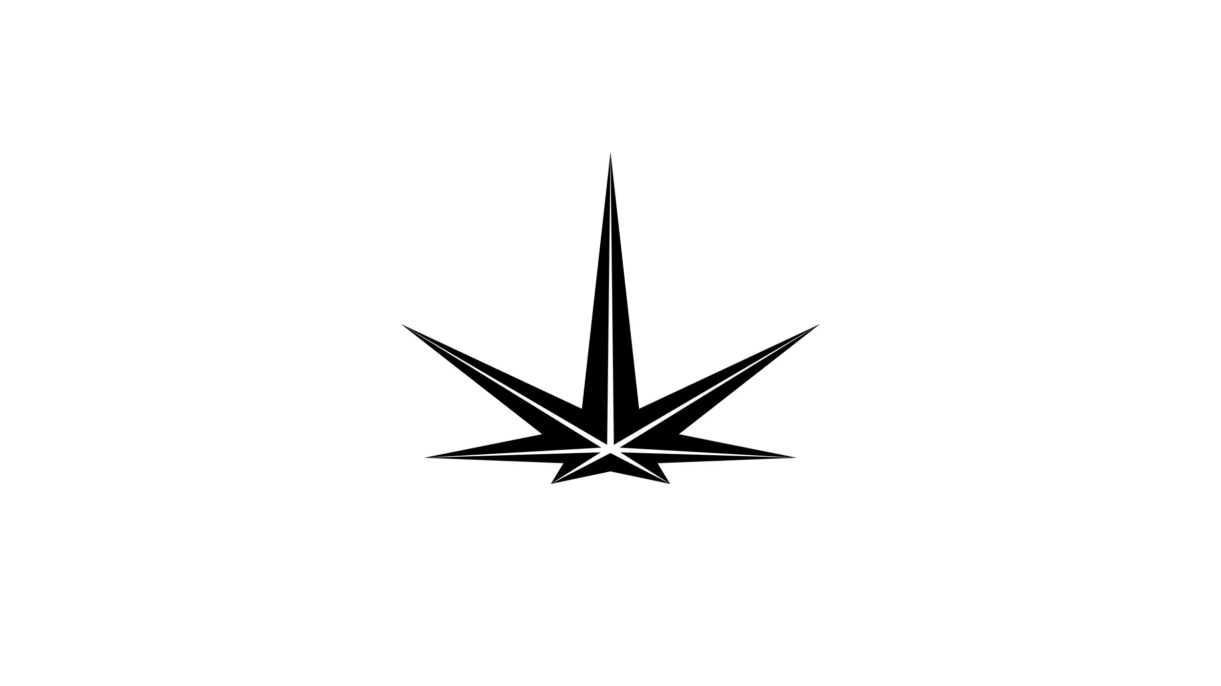
The star/leaf represents the north star, the curvature just below in the brand name represents the curvature of the globe on the horizon. The humanistic Gilroy typography completed the composition harmoniously.
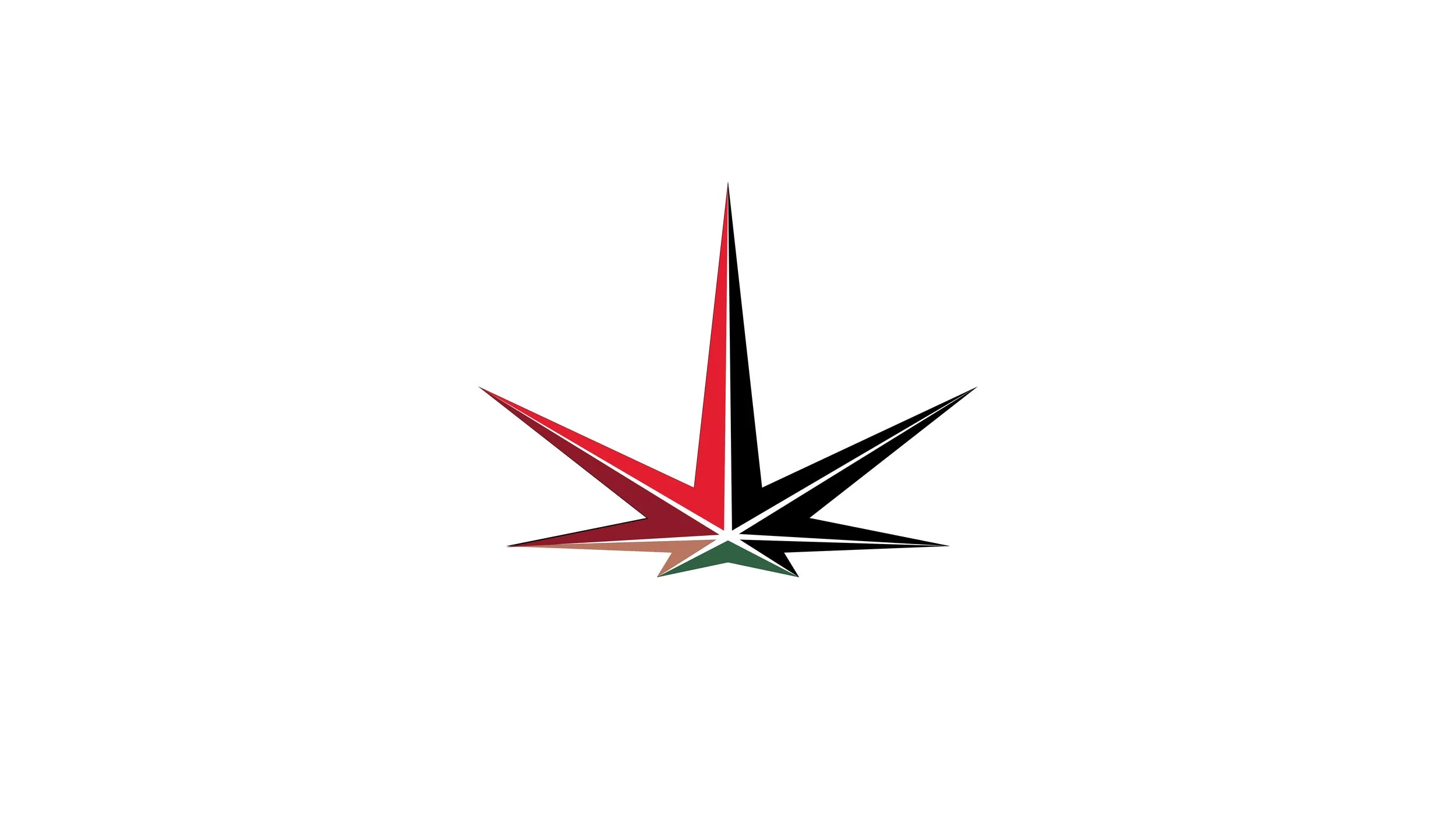
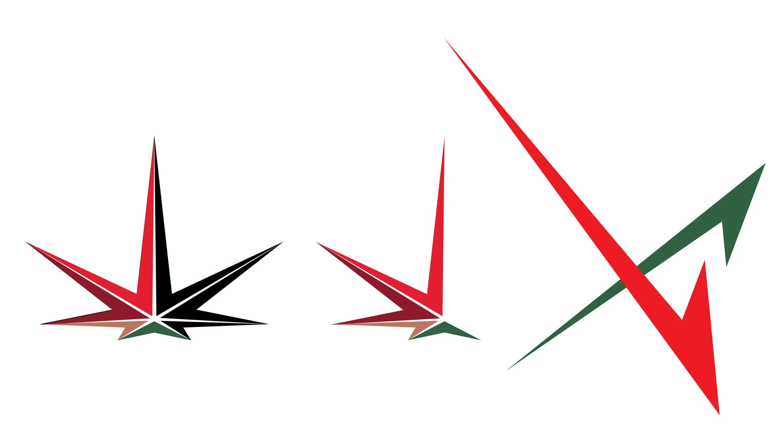
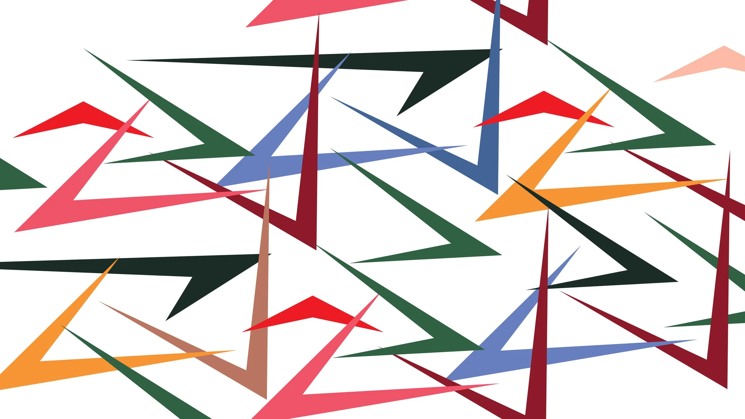
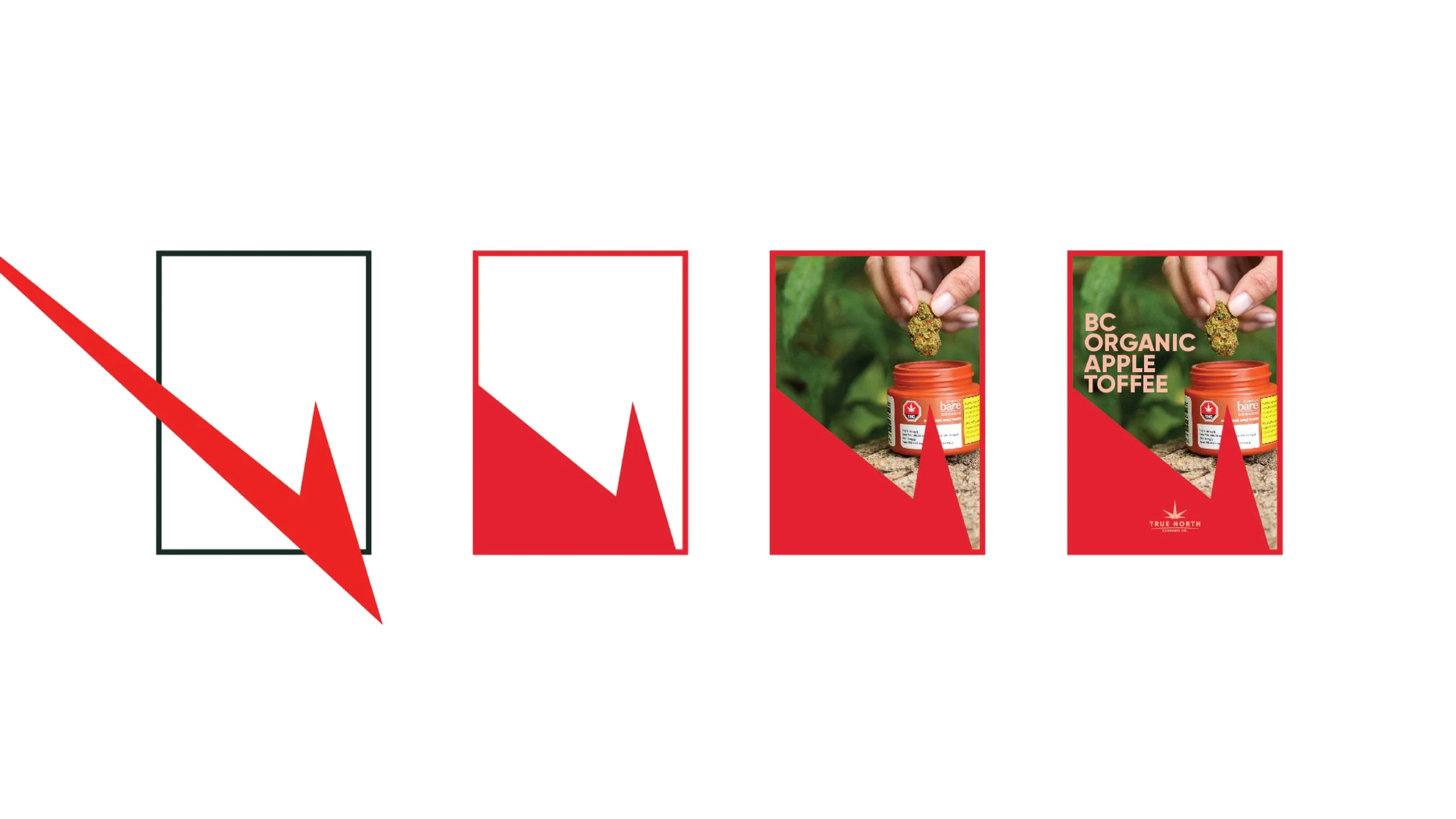
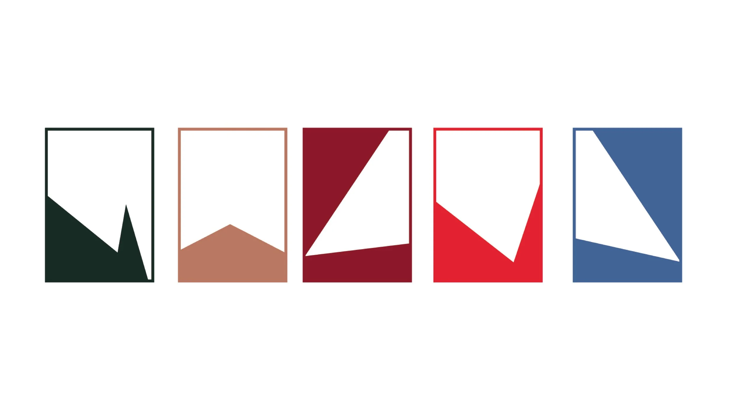
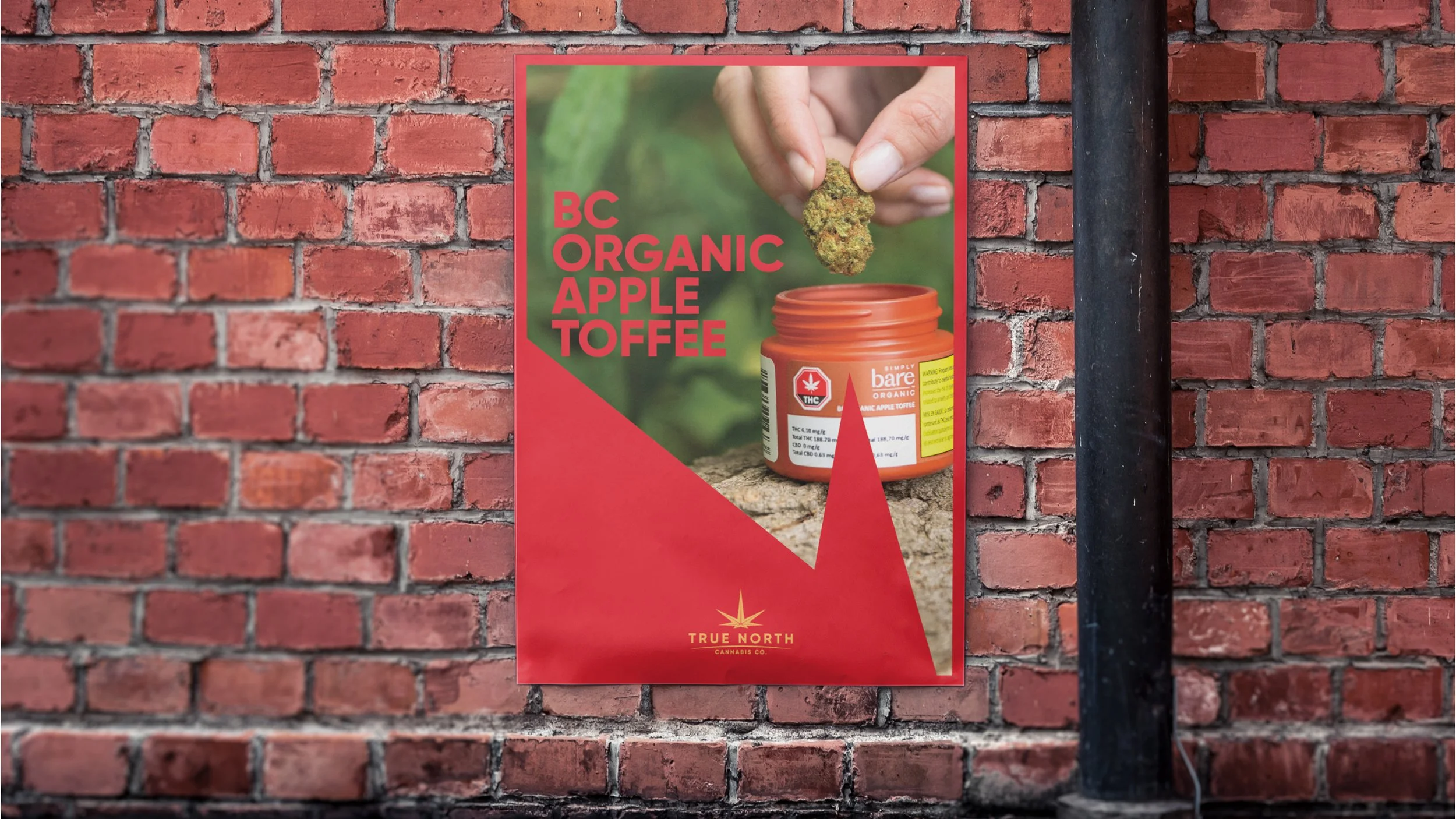
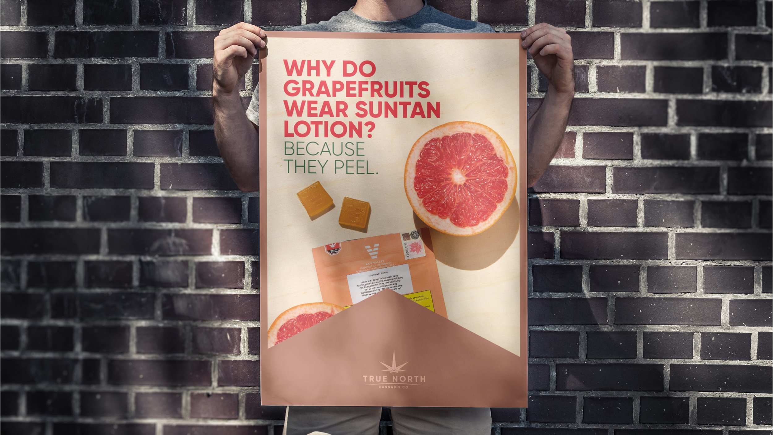
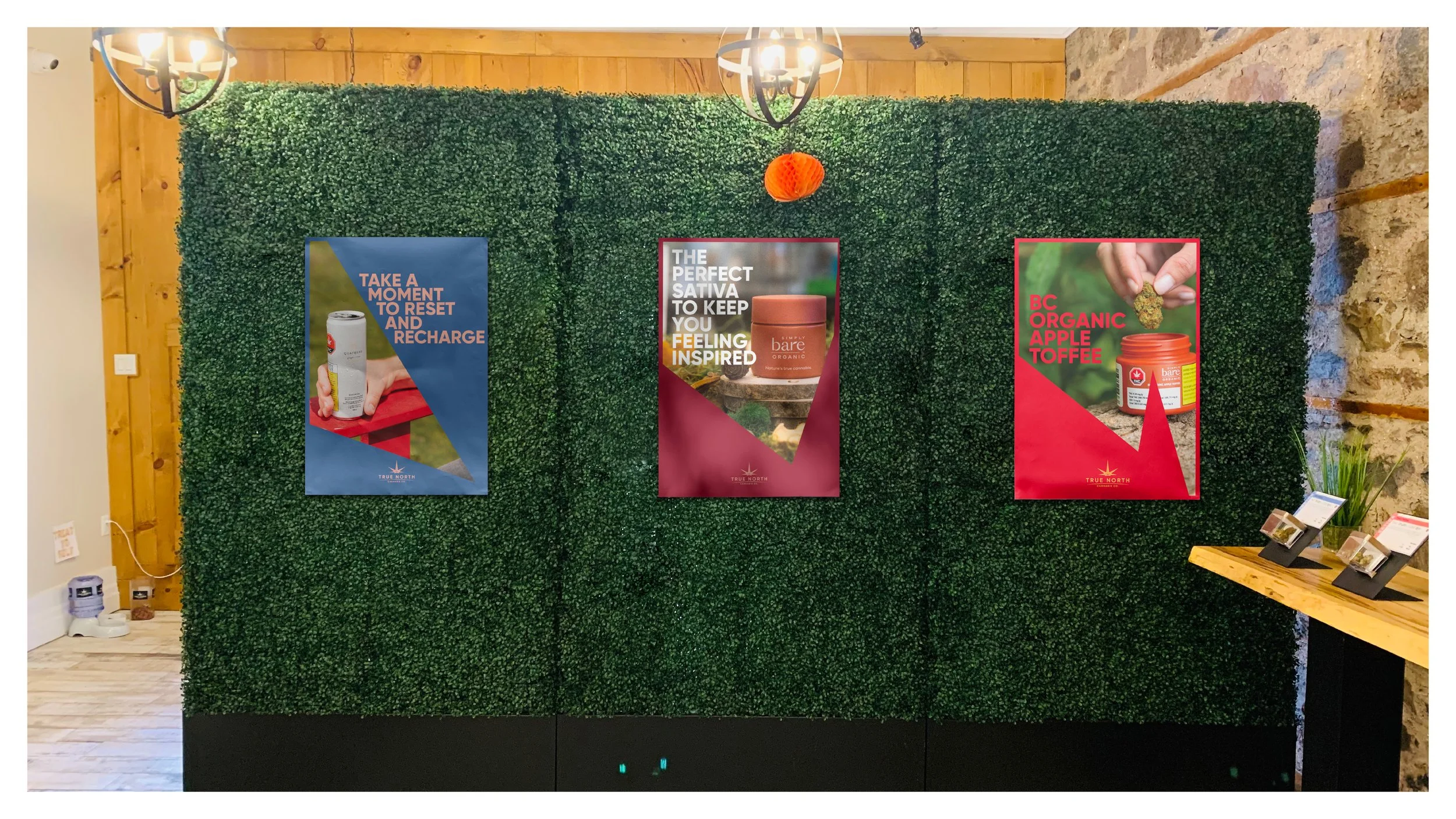
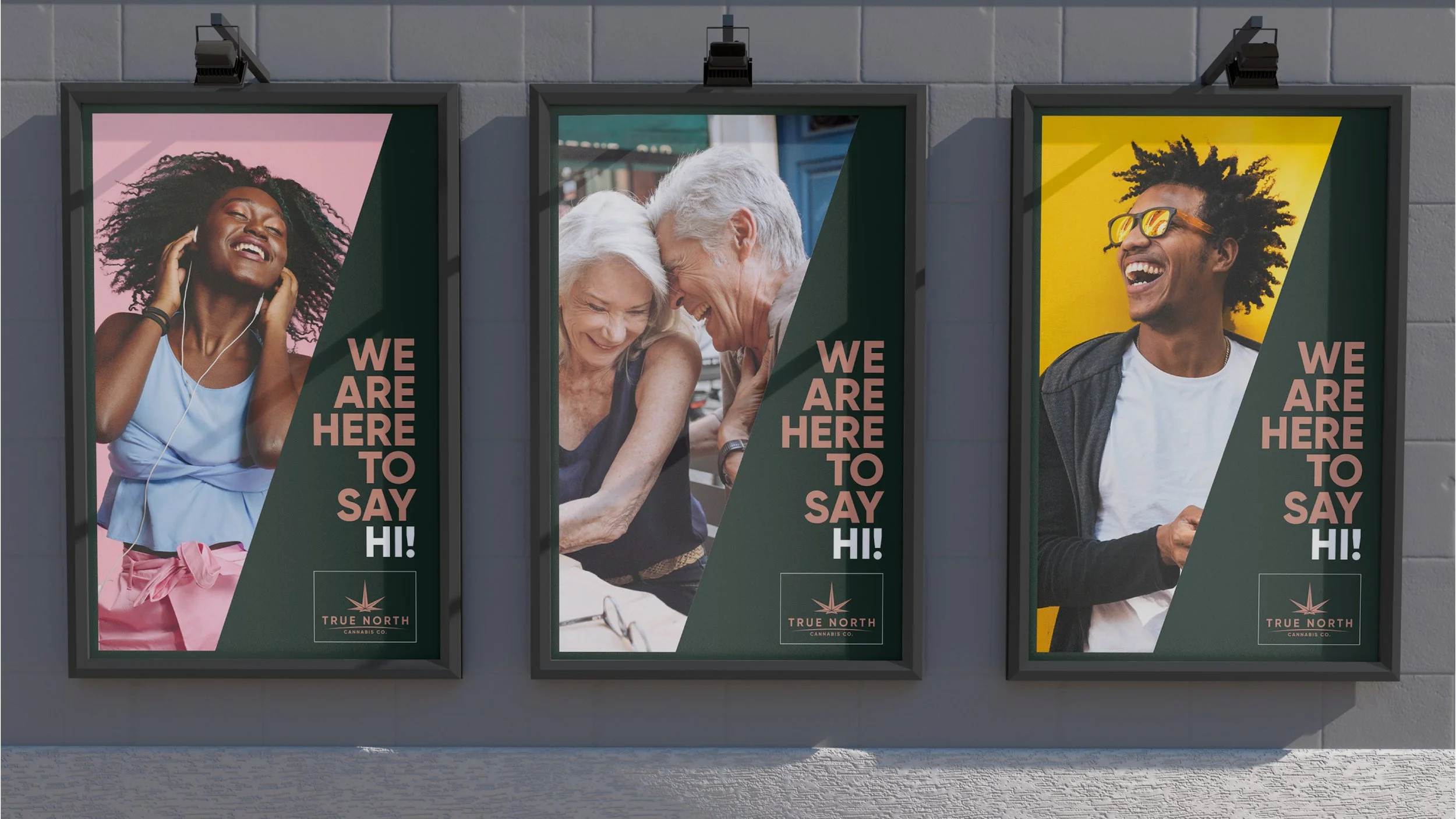
In order to have a nice and strong visual presence, I started playing with a Design System. Check this out:
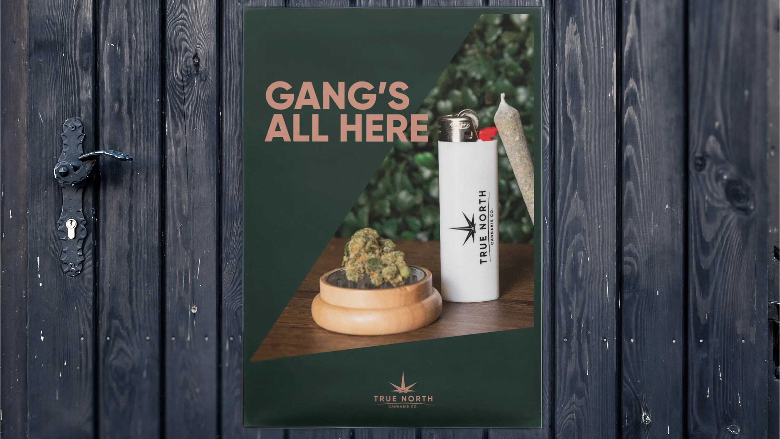
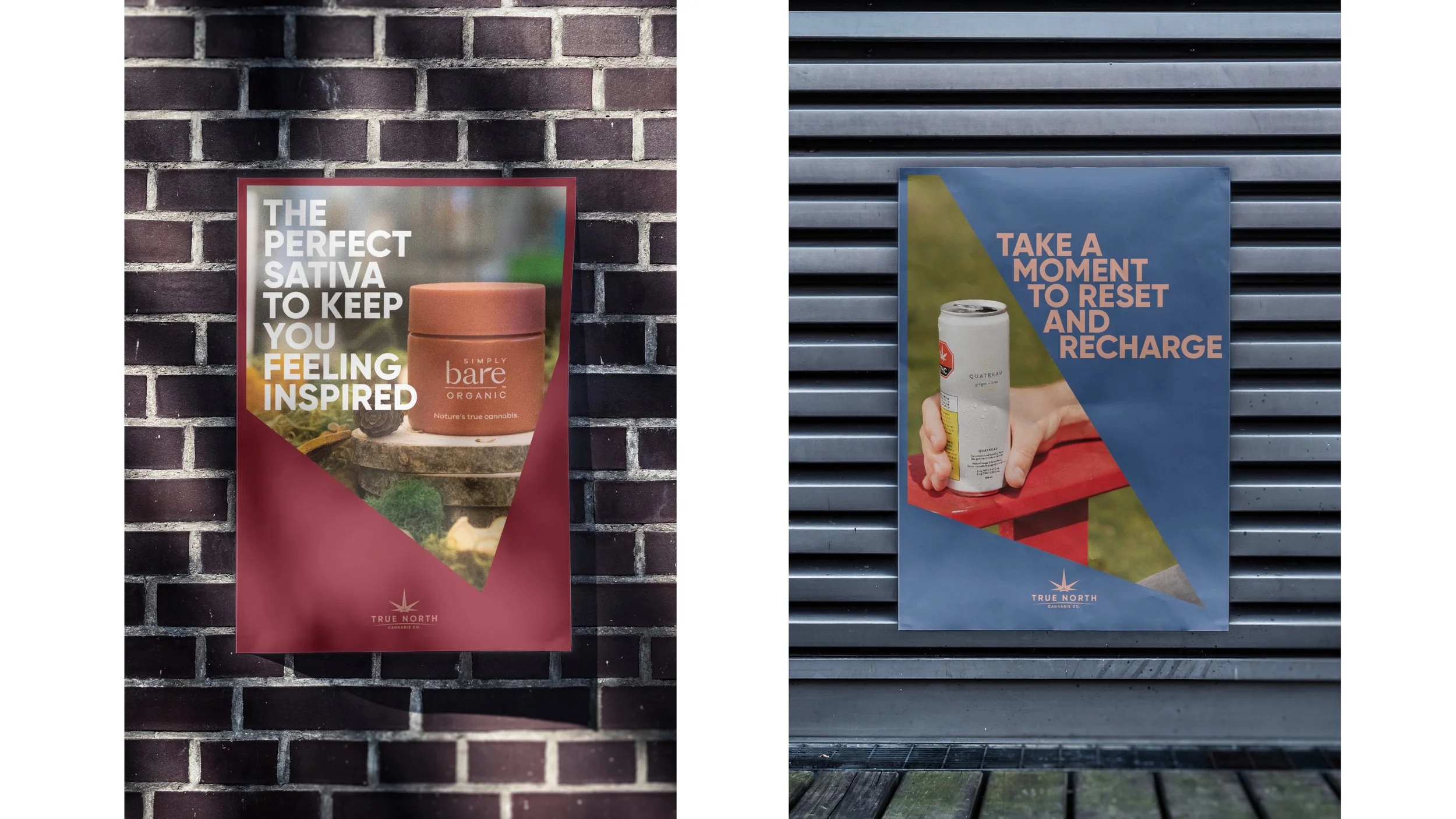
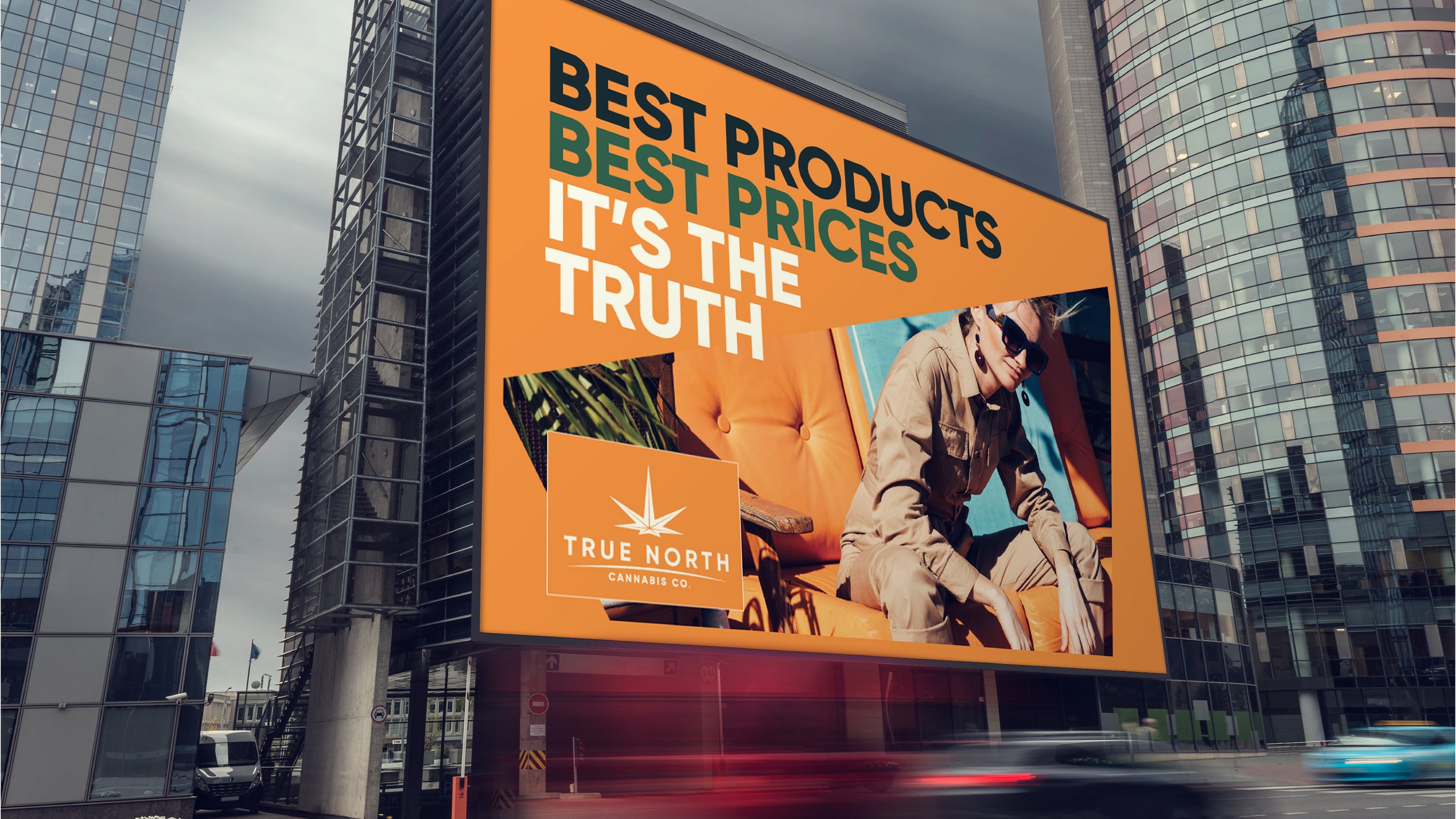
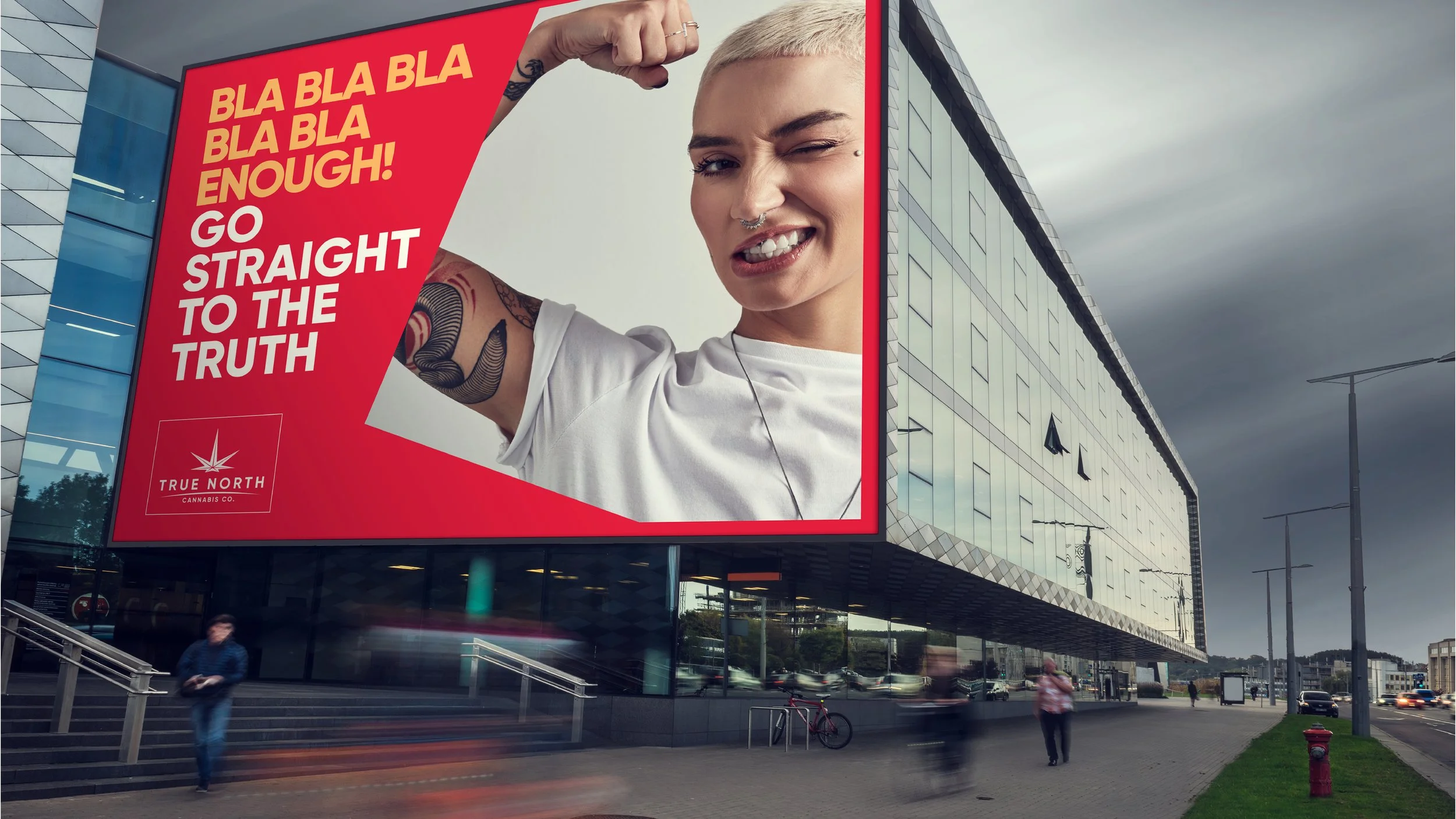
That said, the development of any kind of communication should be as simple as that.
I was also responsible for the tone of voice of the brand, based on the "out law" archetype.
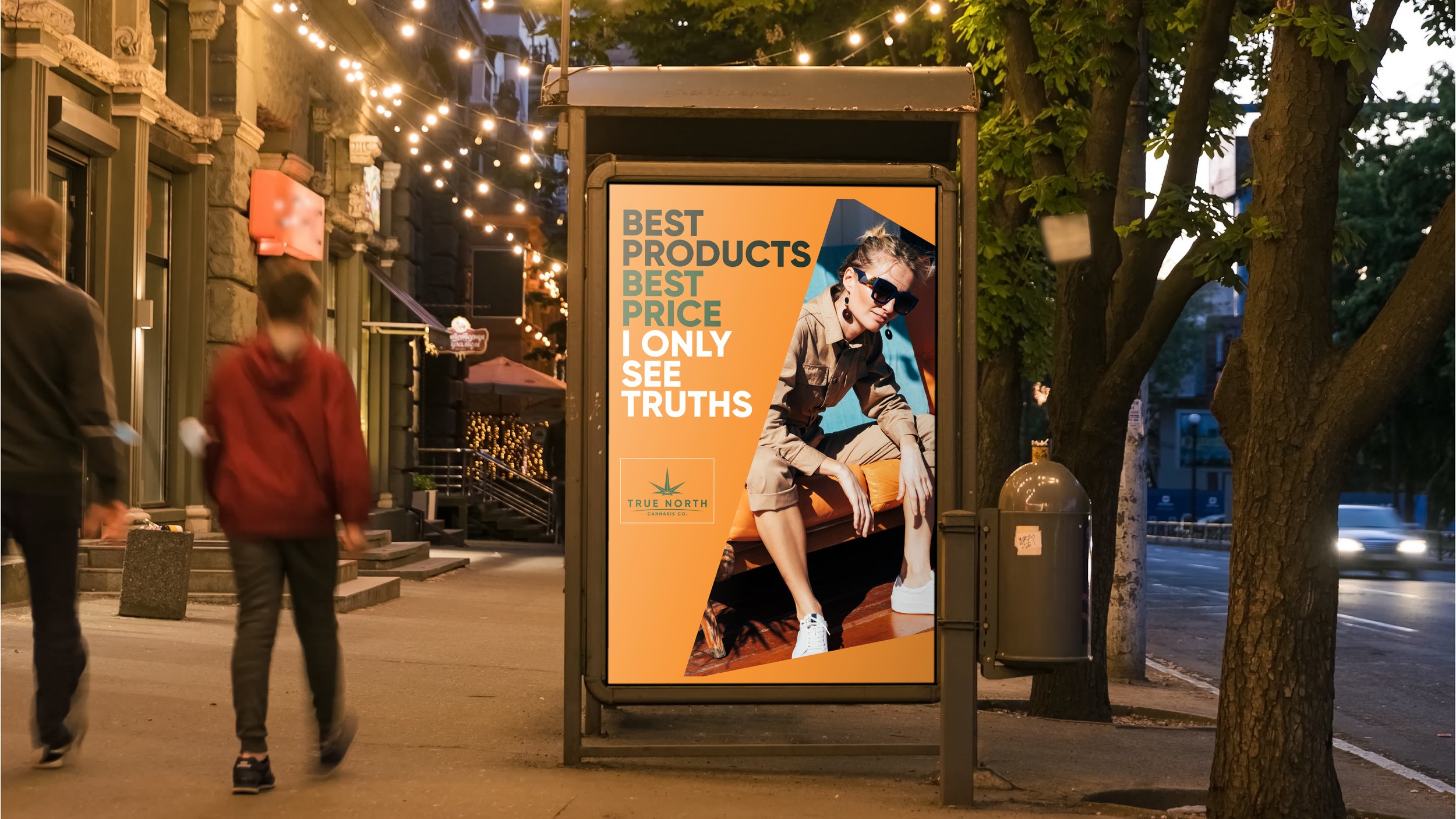
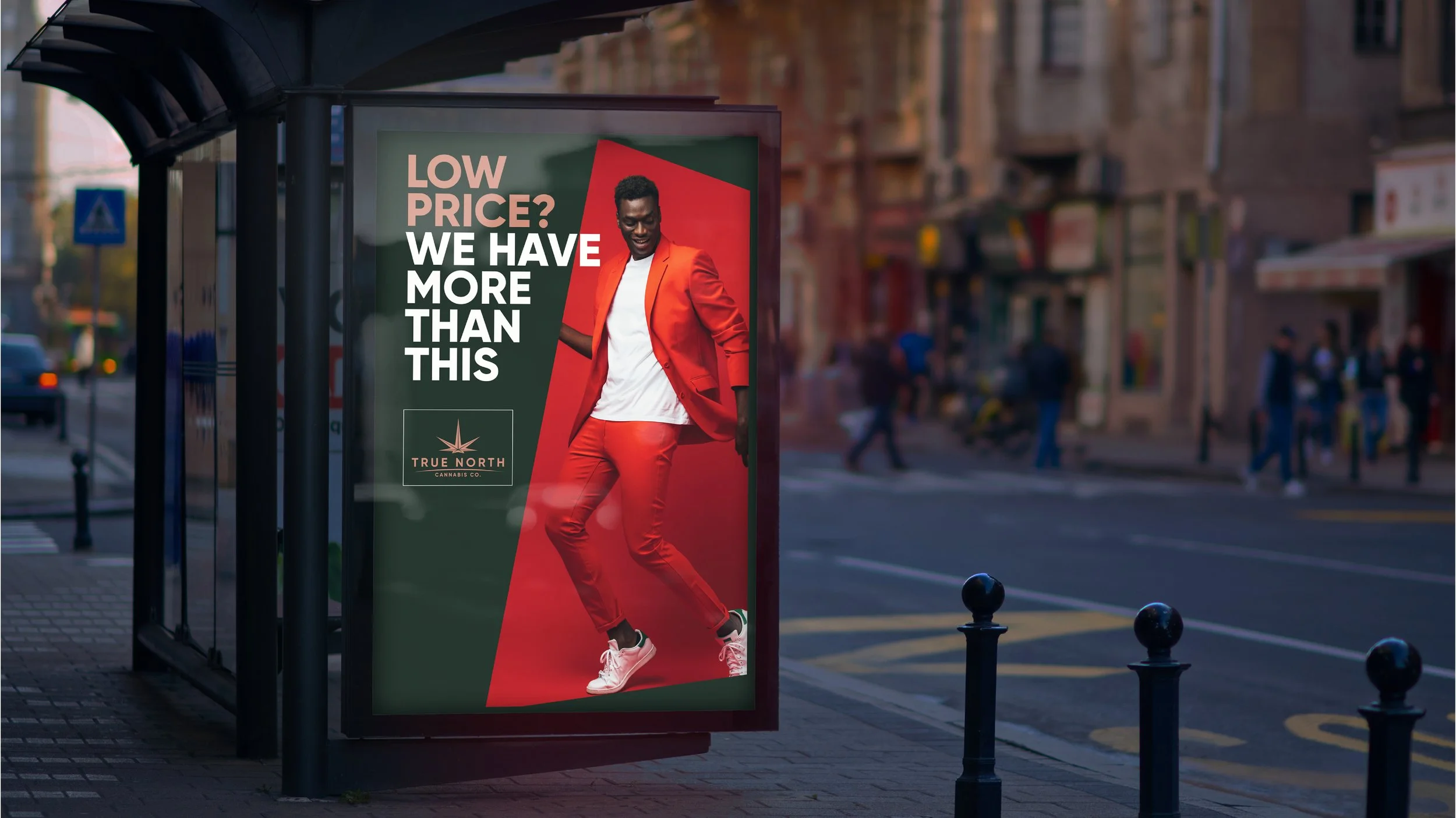
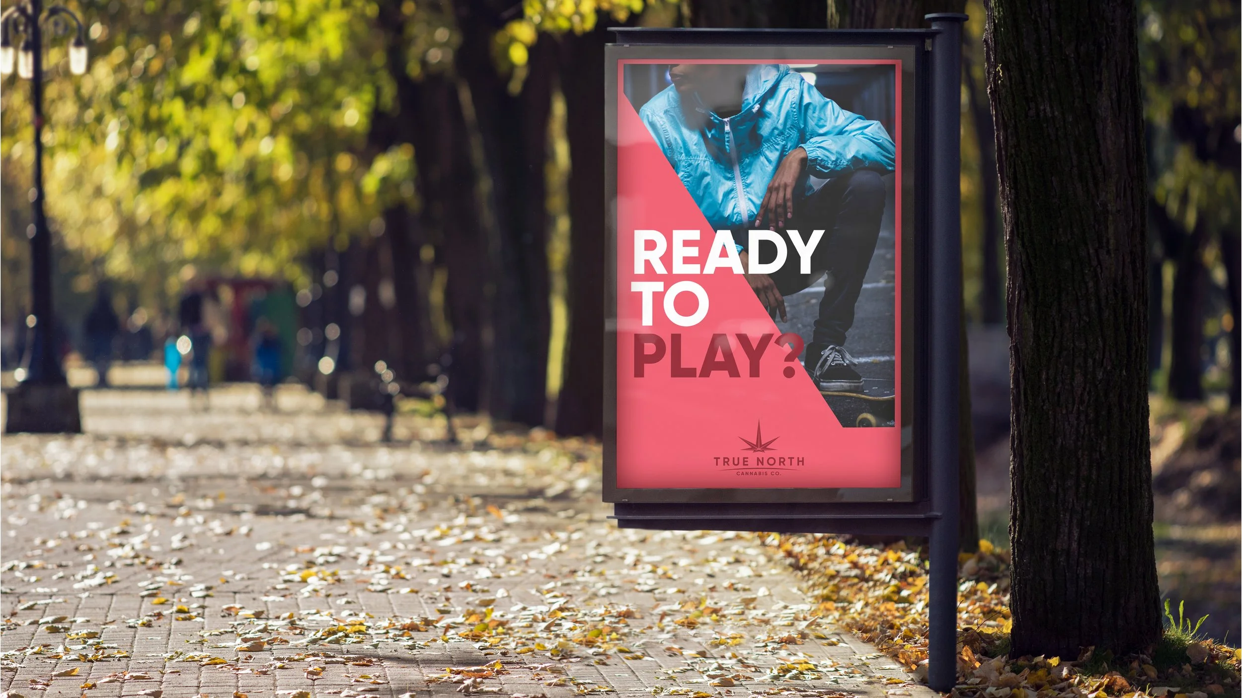
The Design System gives the brand the power to be cohesive, powerful, modern, and endless ways to play with the visual elements of the brand.
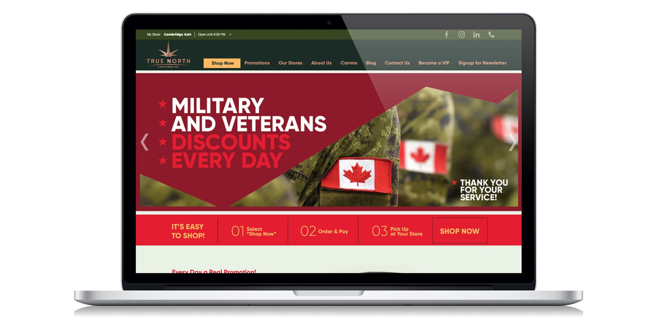
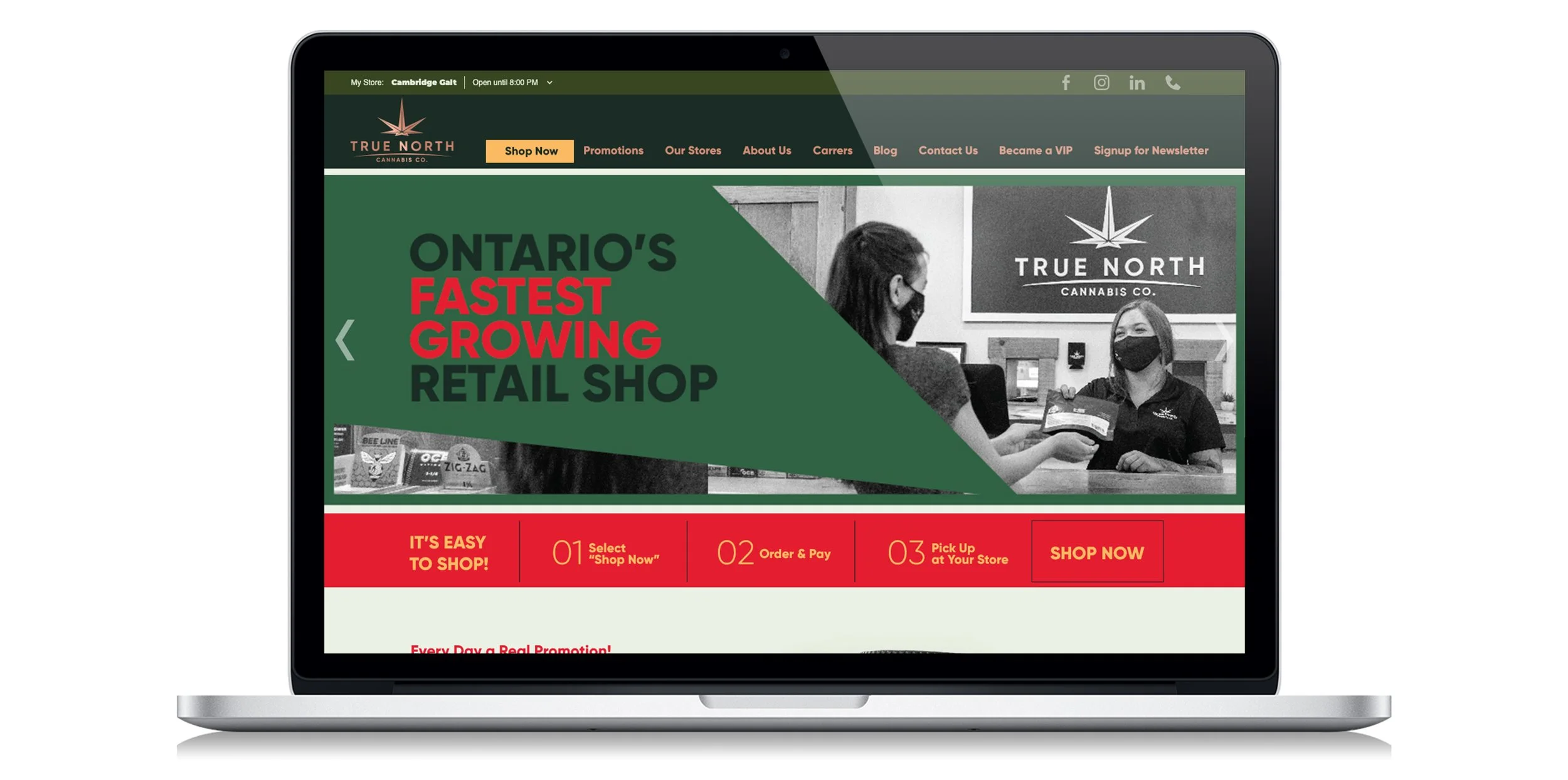
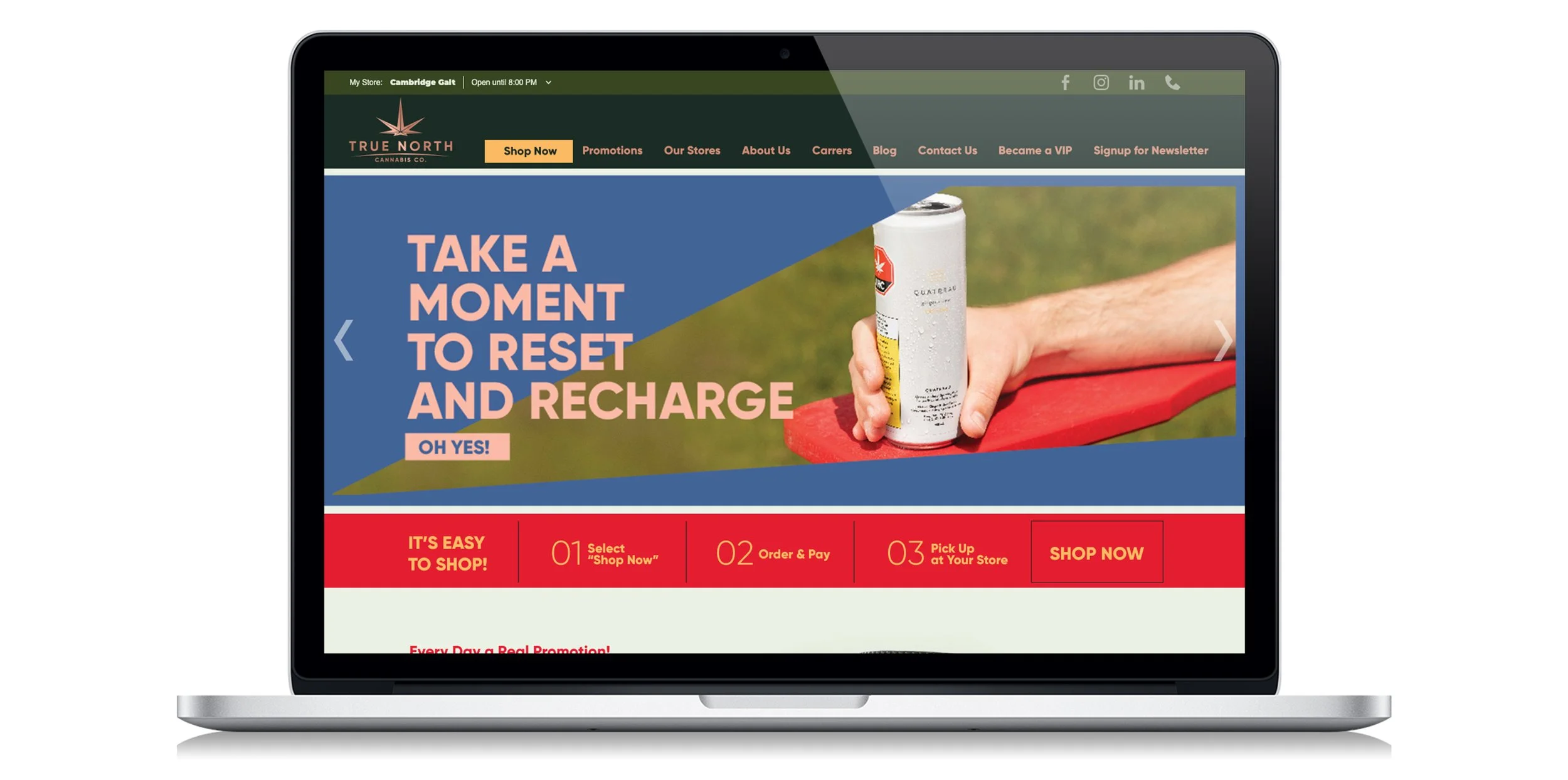
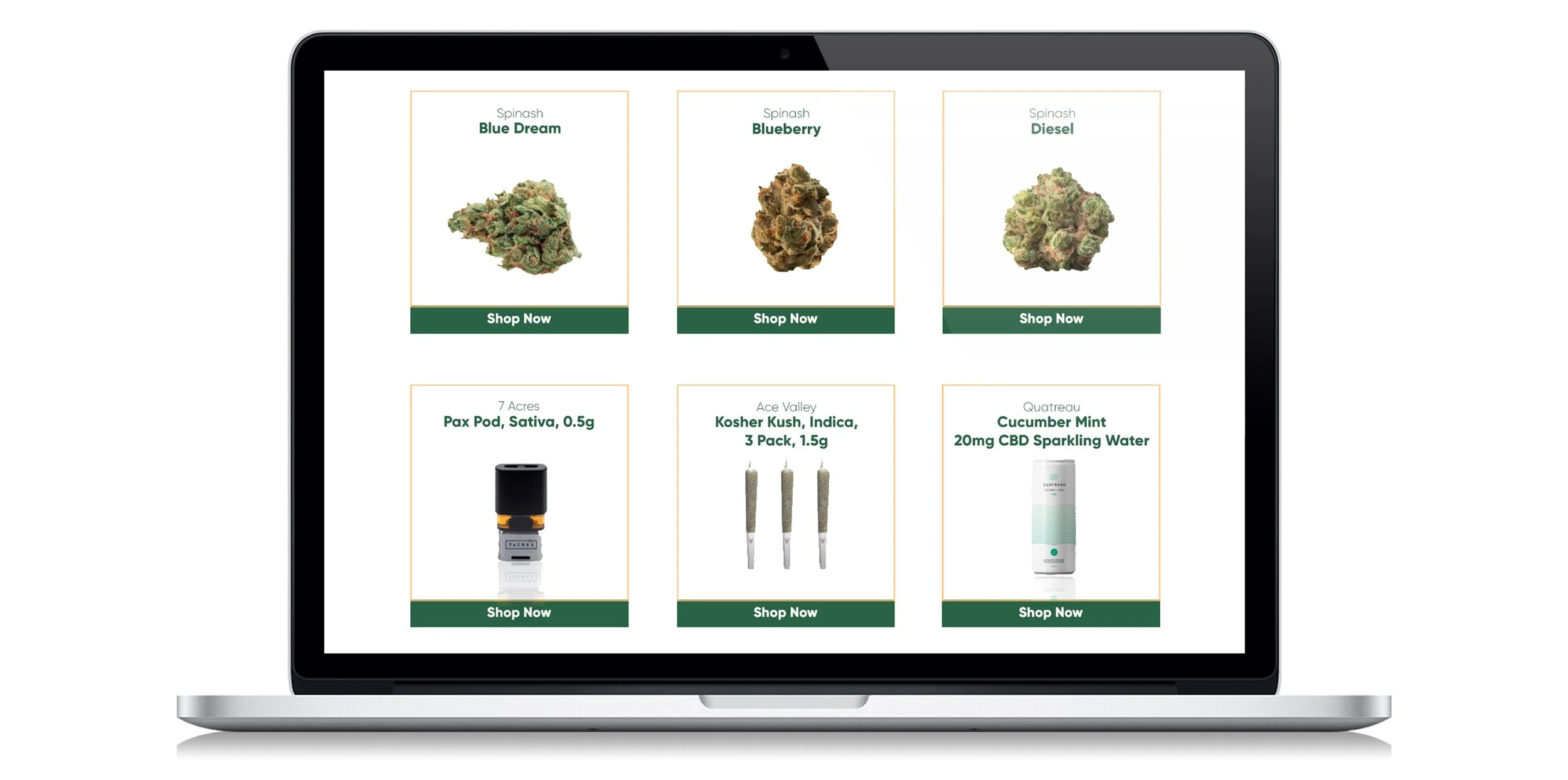
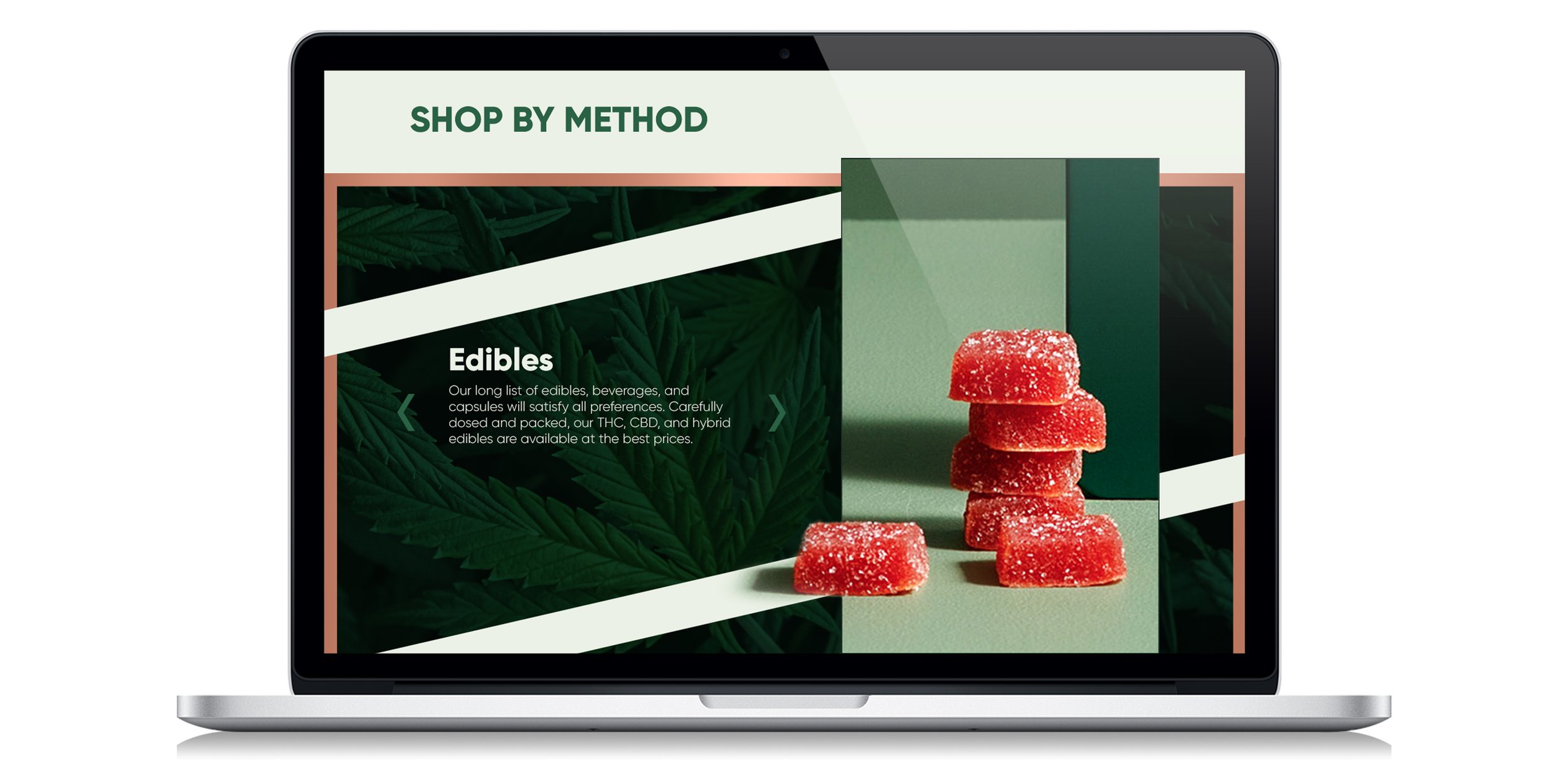
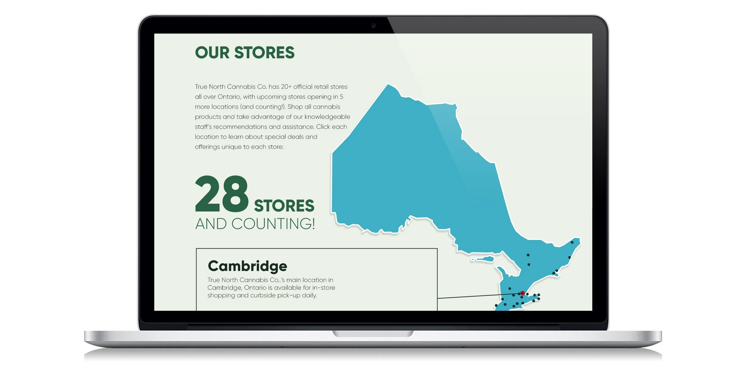
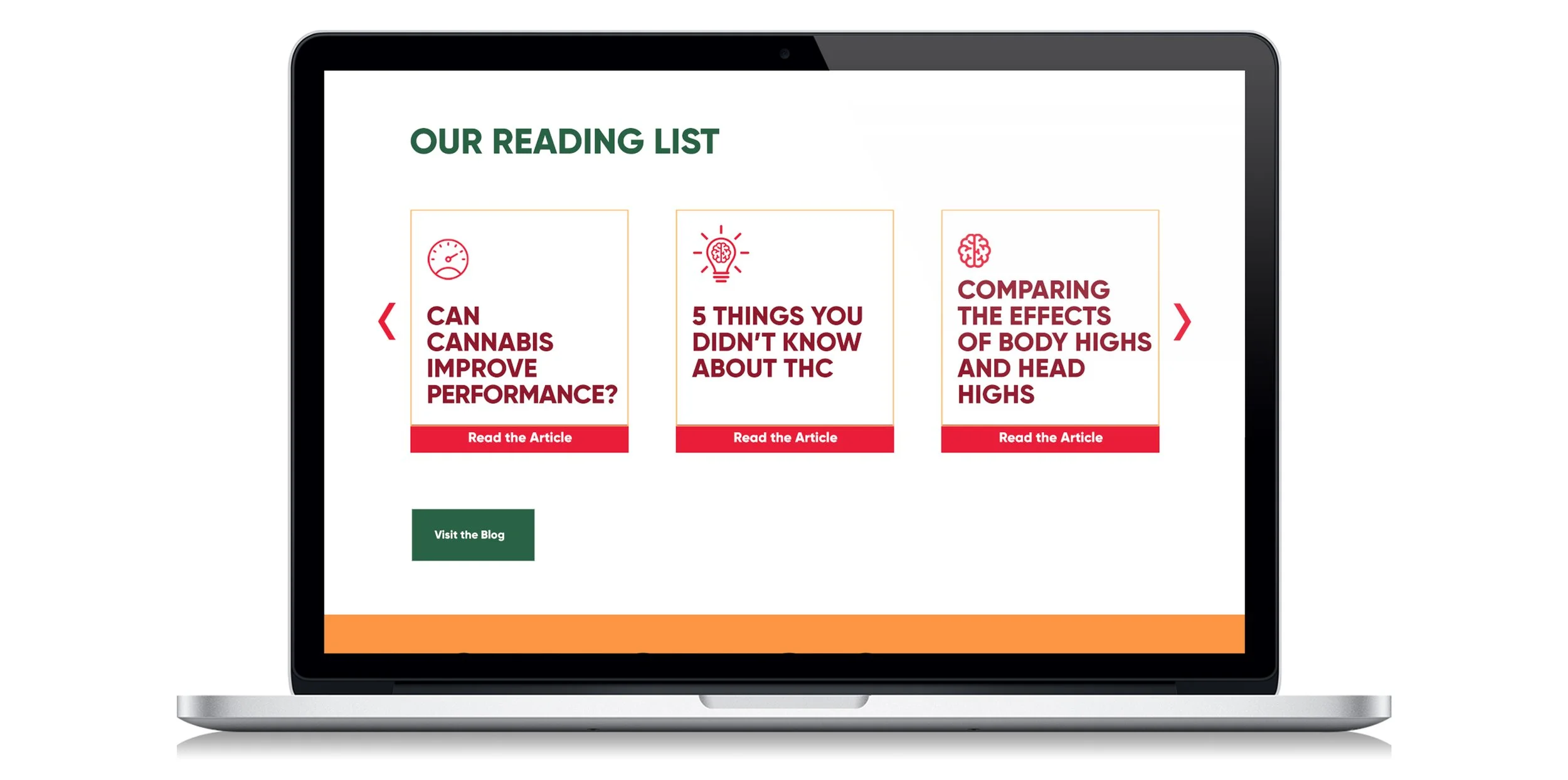
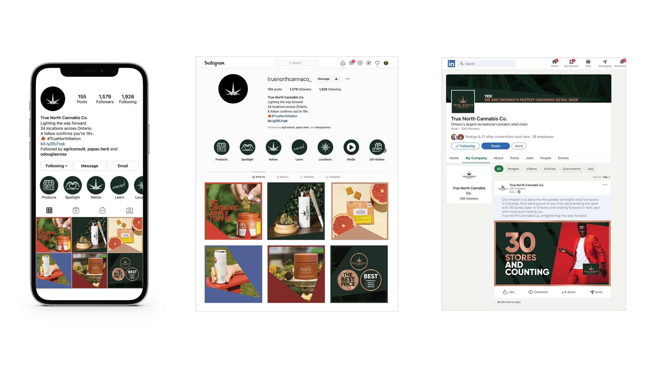
Website, Instagram, Linkedin and lots of online media was developed.


And here I am, happy and surrounded by this wonderful work. Thank you for watching :)